
Understanding the problem
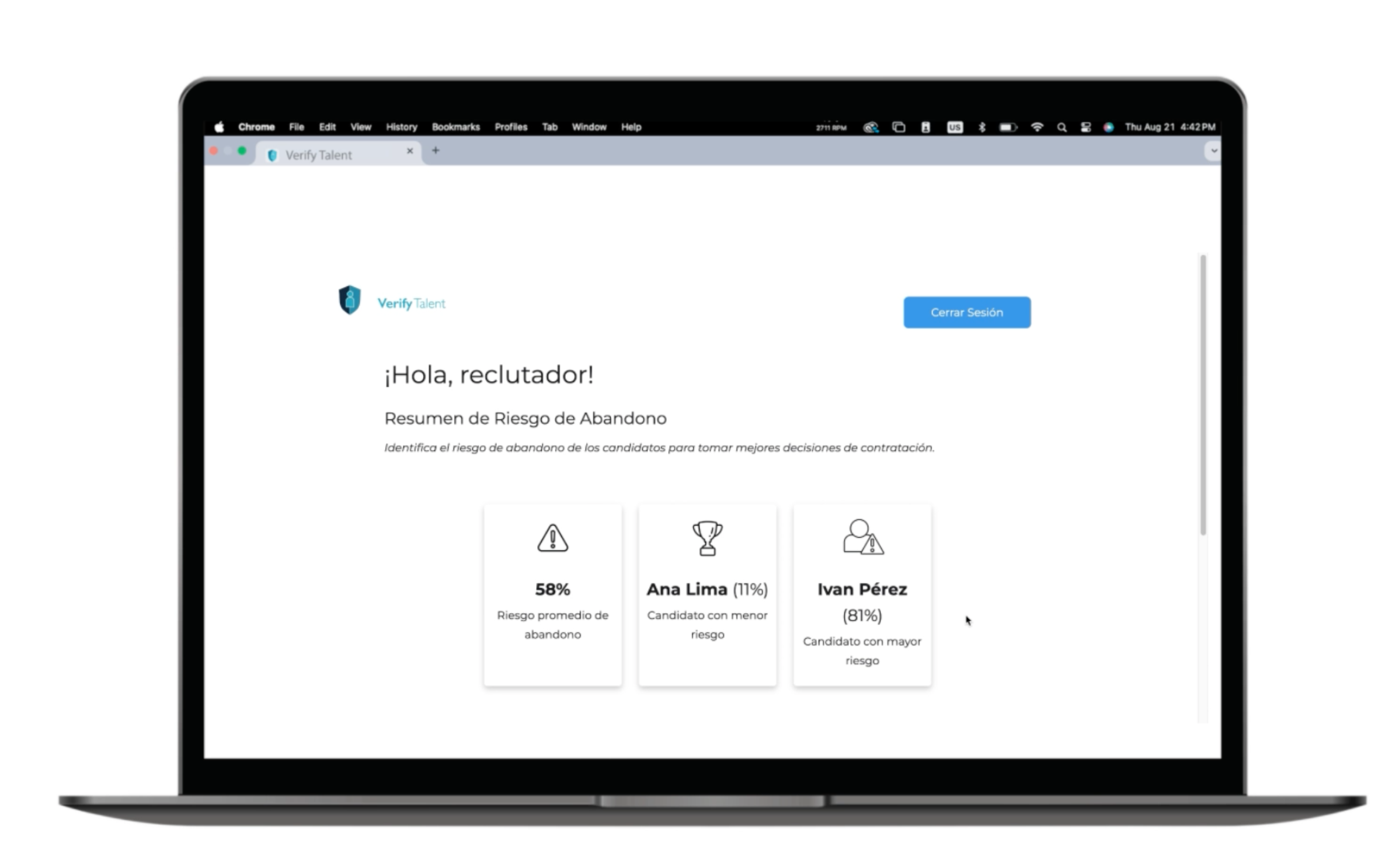
Recruiters play a key role in deciding who joins a team, and the impact of a new employee can be huge for a company. With how costly it can be to acquire talent, companies want to make sure their employees are a long term investment.
Diving deep into user needs
Conducted a competitive analysis and white paper research to understand how users currently solve this problem.
Exploring solutions
Brainstorming sessions and concept development to generate innovative solutions for identified problems.
Crafting the experience
High-fidelity designs, prototyping, and iterative refinement based on stakeholder feedback.
Evaluating the project and learnings
Analyzed site performance post-launch to validate design decisions and identify improvement areas.


If I had the chance to approach this project again, I would prioritize usability testing earlier in the process—even with a small sample of users—since iterative feedback is essential for refining interaction patterns and ensuring a more intuitive experience.
Given that this was a short-term MVP built by a very small team, our focus was on delivering core functionality, which meant testing and iteration were limited. Another key learning was around responsive design: because the product was conceived as a web app with a large volume of information, adapting the interface for mobile created usability challenges and constrained the overall experience.
Despite these limitations, the project gave me valuable hands-on experience with information architecture, API integration, and web development, which strengthened my ability to design more scalable and user-centered digital products in the future.